Project Duration
2 Months
Role
UX Designer Generalist. This is an independent project, where I practiced all components of UI/UX Design.
Overview
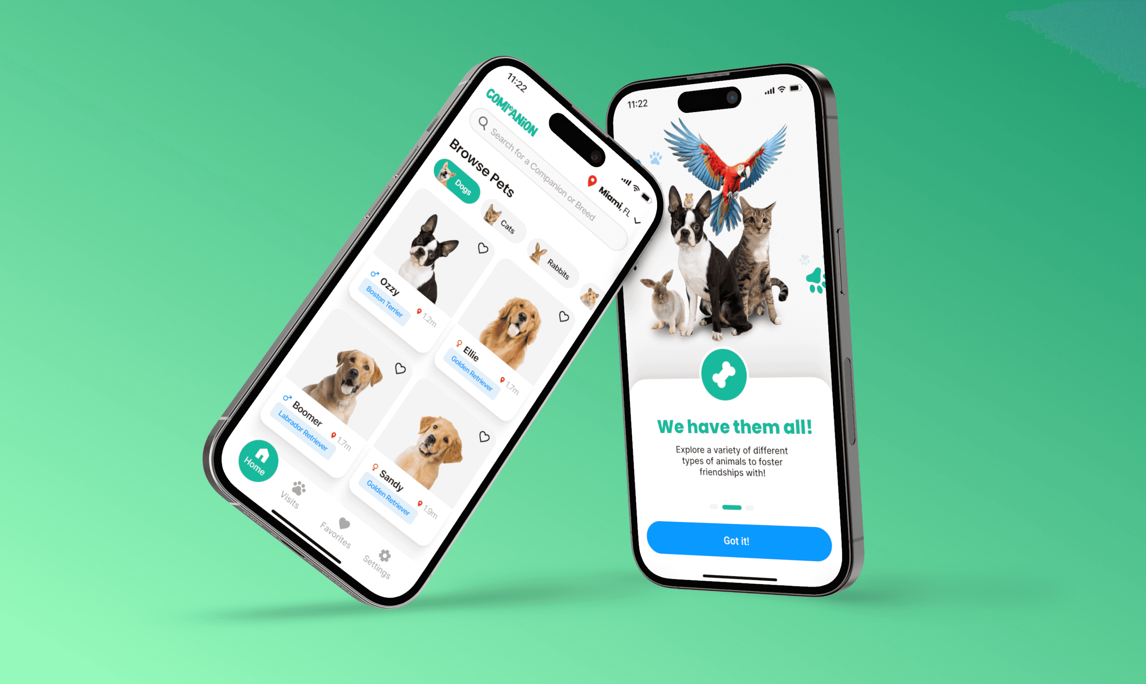
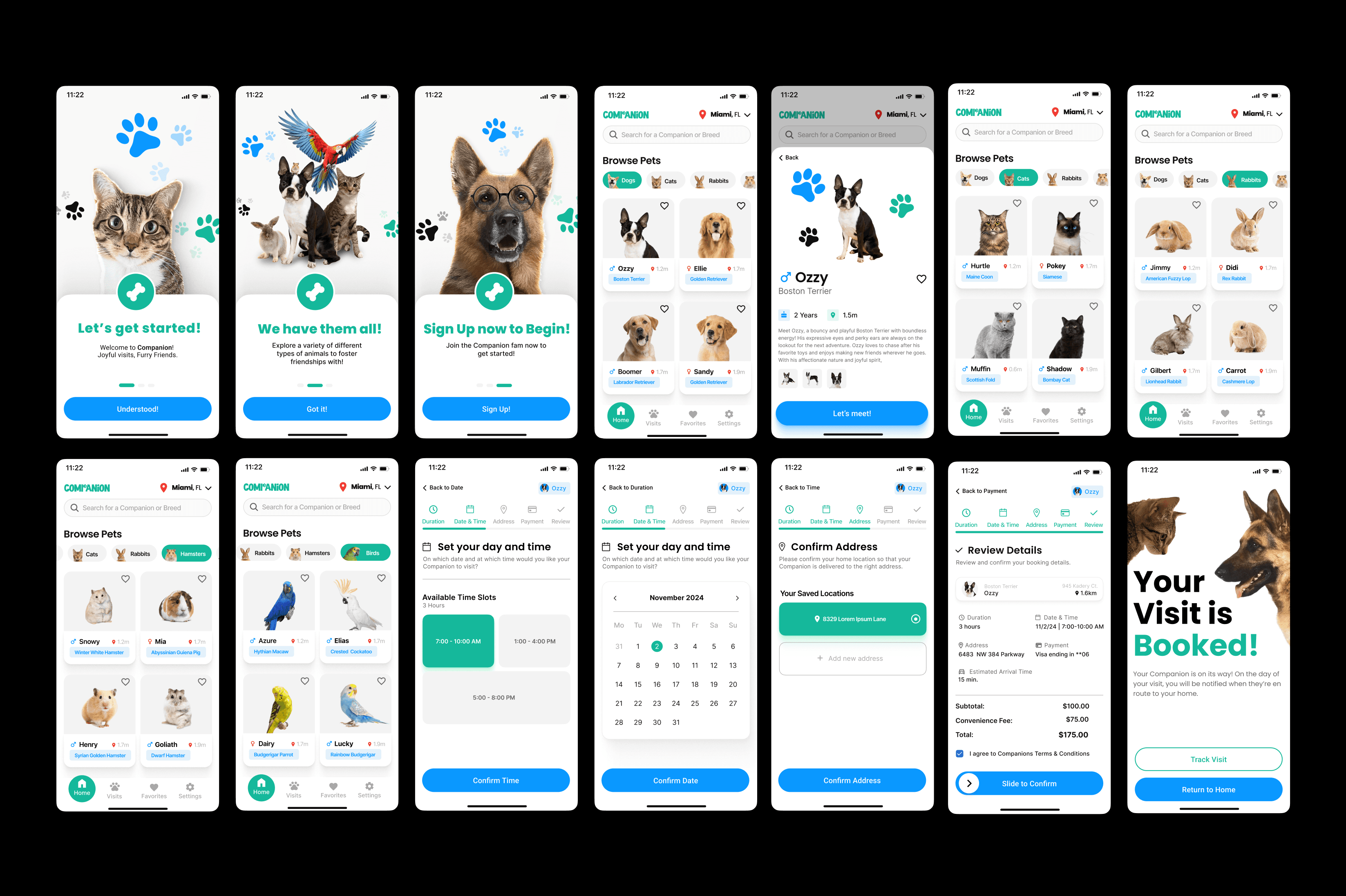
I first started the Companion project back in 2022 and it has been one of my most cherished designs since. But as I concluded my internship at Capital One and was awaiting my return, I decided to attempt a redesign now that my skills have improved significantly since then.
After all, in 2022 I was just starting UX and my only goal was to get my portfolio started. The original design was solid at the time but — as i look back now at my old work, there were several design flaws I've noticed and sought to resolve and improve. These varied from usage of whitespace, to inconsistencies in typography, mismatches in and lackluster usage of color, or just the design components/elements in general were not too elegant.
The user flow and jist of the product itself was fine — but this redesign functioned as a visual overhaul and a streamlined, cleaner user interface.
Booking User Flow
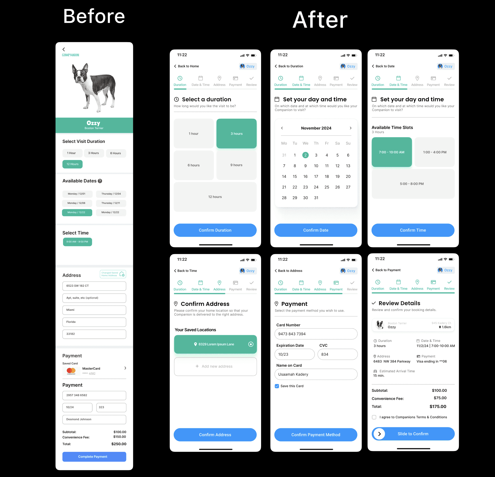
For the booking user flow in particular, initially it was an endless vertical scroll that provided the options selecting date, time, duration, payment methods, and address. This was an erroneous design decision as it can overwhelm users with too much information at once, making it difficult to navigate and potentially causing them to miss important details.
Instead I now opted for a conventional, multi step process; a multi-step process is better because it simplifies complex tasks by breaking them into smaller, manageable steps, reducing user overwhelm and improving overall usability.
Home Screen
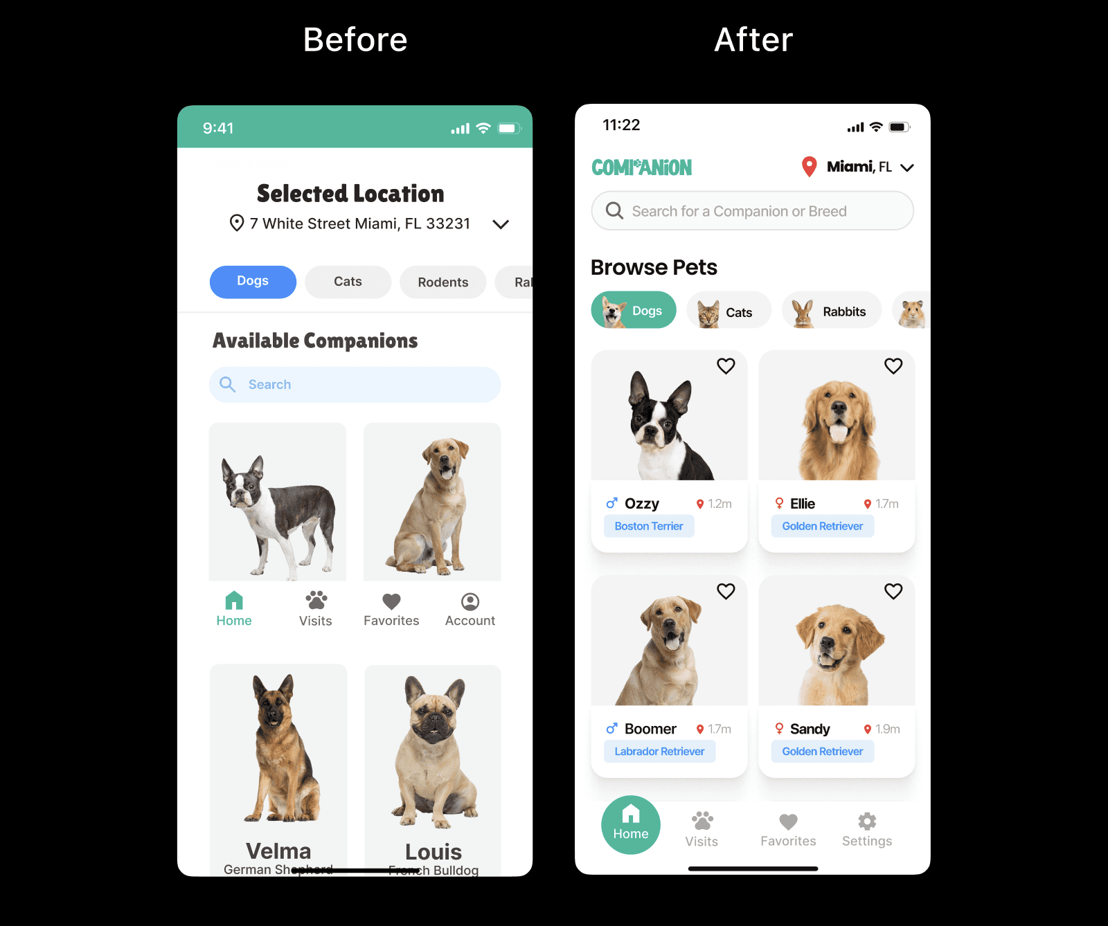
Naturally the home screen was redesigned. The "After" design is superior to the "Before" design due to its cleaner, more organized interface, which enhances usability and user engagement. By prominently placing pet categories at the top, users can easily filter and find the pets they are interested in without unnecessary scrolling.
The improved search functionality is better integrated, making it more accessible. I also ensured that larger images with clear labels for each pet's name and breed, along with prominent heart icons for favoriting, make browsing more intuitive and engaging. Additionally, location indicators provide useful proximity information, and the refined navigation bar simplifies movement between different sections. Overall, the modern aesthetic and improved visual hierarchy make the "After" design more user-friendly and visually appealing.
Visits Screen
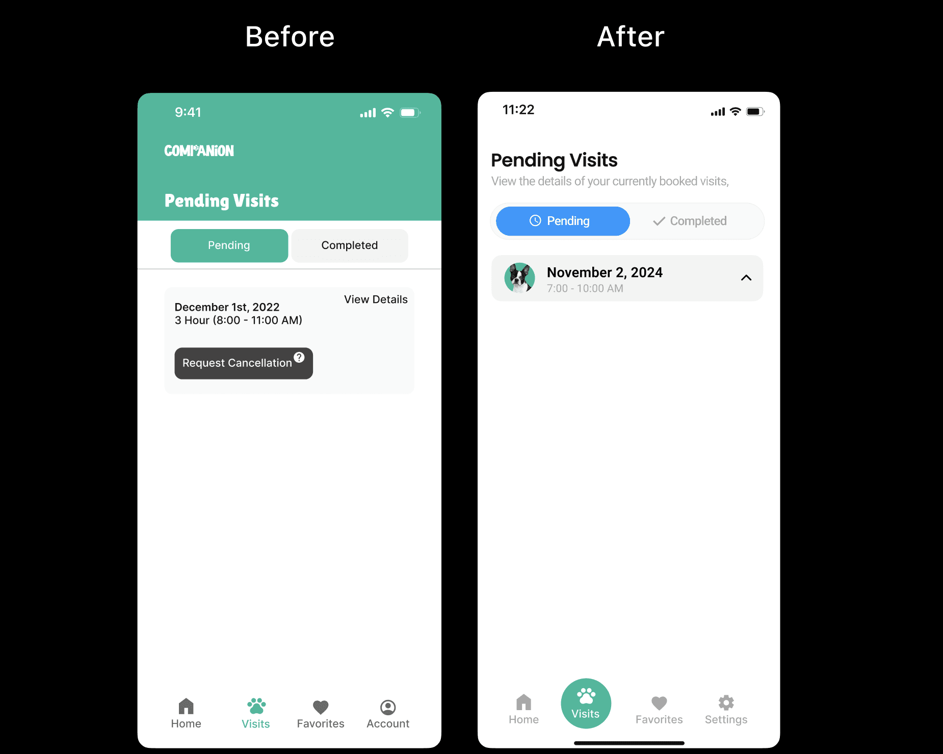
For the visits screen, where the user can monitor their current visits and view their visit history, I made the redesign better than the original by providing a more streamlined and intuitive user experience, with clearer navigation and better organization of information.
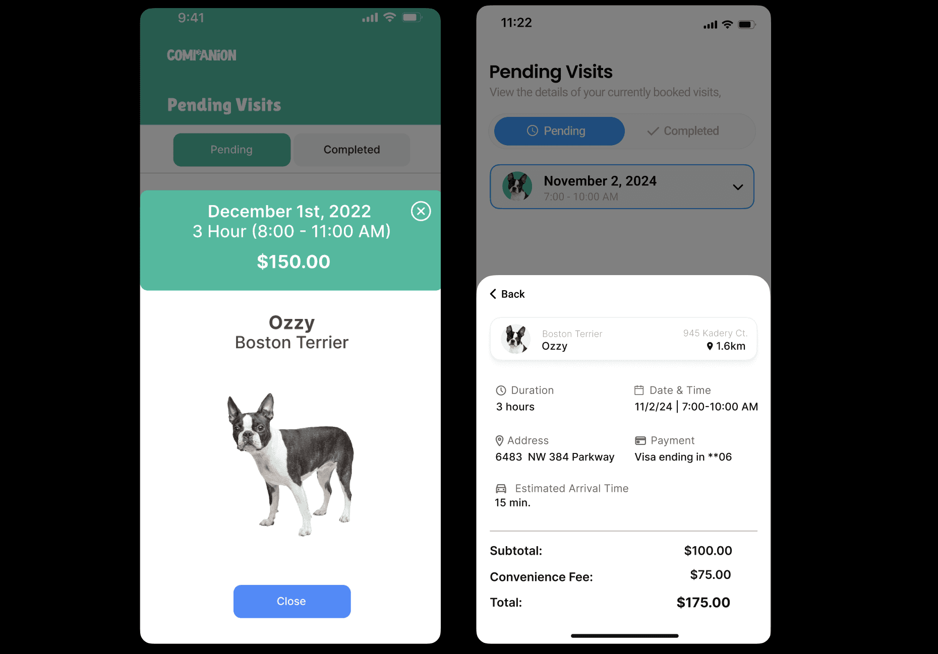
The new design features a cleaner interface, with more visually distinct tabs for pending and completed visits, making it easier to differentiate between them. I ensured that the detailed view of a pending visit is more comprehensive, displaying all relevant information such as date, time, duration, address, payment details, and estimated arrival time in one place. This reduces the need for additional navigation and helps users quickly access the information they need. Additionally, the modern aesthetic and improved use of whitespace enhance readability and overall visual appeal, making the app more user-friendly.
Companion Profile Screen
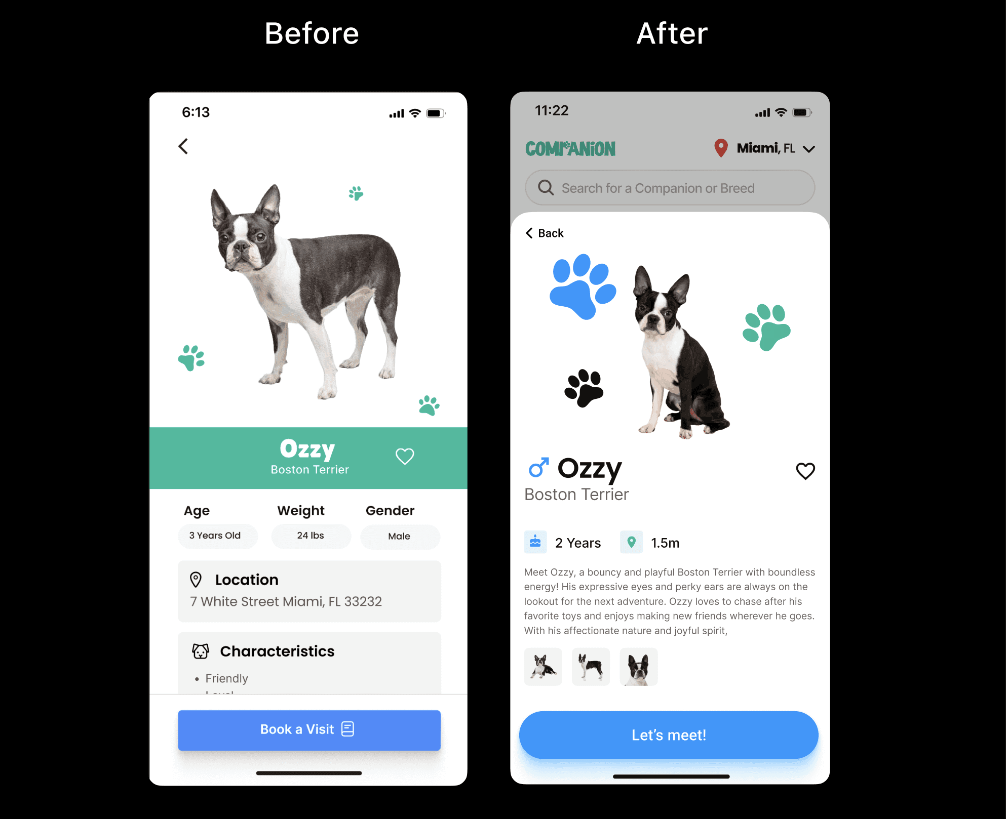
Each Companion on the app has their own profile, displaying some of their characteristics and facts such as breed, gender, etc.
The redesign is an improvement in various ways; it effectively uses a popup format to highlight key information and encourage user interaction. The popup design draws the user's attention to the most important details, such as the dog's name, breed, and age, without overwhelming them with unnecessary information. This focused approach makes it easier for users to quickly assess whether the dog is a good match for their preferences. Additionally, the popup's compact size ensures that it doesn't disrupt the overall user experience while still providing essential information.
I also designed it in a way that it provides a more intuitive and engaging user experience. The cleaner layout and improved visual hierarchy make it easier for users to find and understand the information they need. By aligning with modern UI conventions and using a more visually appealing design, the after design is more engaging and accessible to a wider range of users.
Onboarding Splash Screens
For the onboarding splash screens, I used the same design structurally but provided some improvements to the visuals and my usage of whitespace and spacing. My redesign is better because it provides a more visually appealing and engaging onboarding experience. The use of consistent branding elements, such as the paw print icon, creates a stronger sense of cohesion throughout the screens.
Additionally, the simplified language and more concise messaging make the onboarding process easier to understand and follow. The redesigned screens also feature a more modern and visually appealing layout, with larger images and a cleaner overall aesthetic. This improved design makes the onboarding process more enjoyable and encourages users to continue exploring the app.
For example, the consistent use of the paw print icon reinforces the brand identity, while the simplified language in the "We have them all!" screen makes it easier for users to quickly understand the variety of pets available. The larger images and cleaner layout in the redesigned screens create a more visually appealing and engaging experience, making it more likely that users will continue through the onboarding process. Overall, these improvements result in a more effective and enjoyable onboarding experience that encourages users to become engaged with the app.
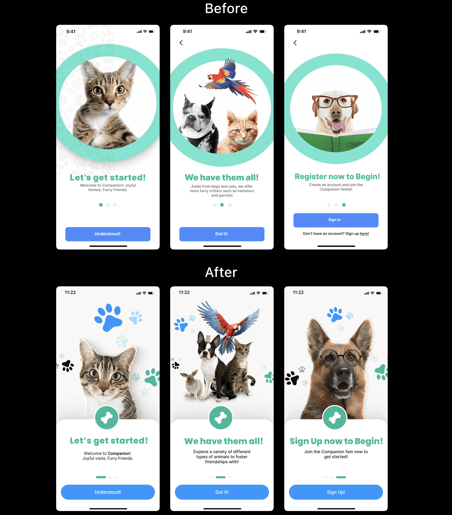
Overall, the onboarding splash screens are vital as these are the very first screens a user will see when they open an app for the first time. If the visuals and overall design aren't exceptional, the user will already be swayed. First impressions mean a lot.

